My father, Stan Wilson, long-ago founder of this design firm, used to tell me, “If you know what something stands for, the rest will fall into place.” He would often bring this up when talking about design, business, or life. And every year, I still see evidence all around that shows just how right he was.
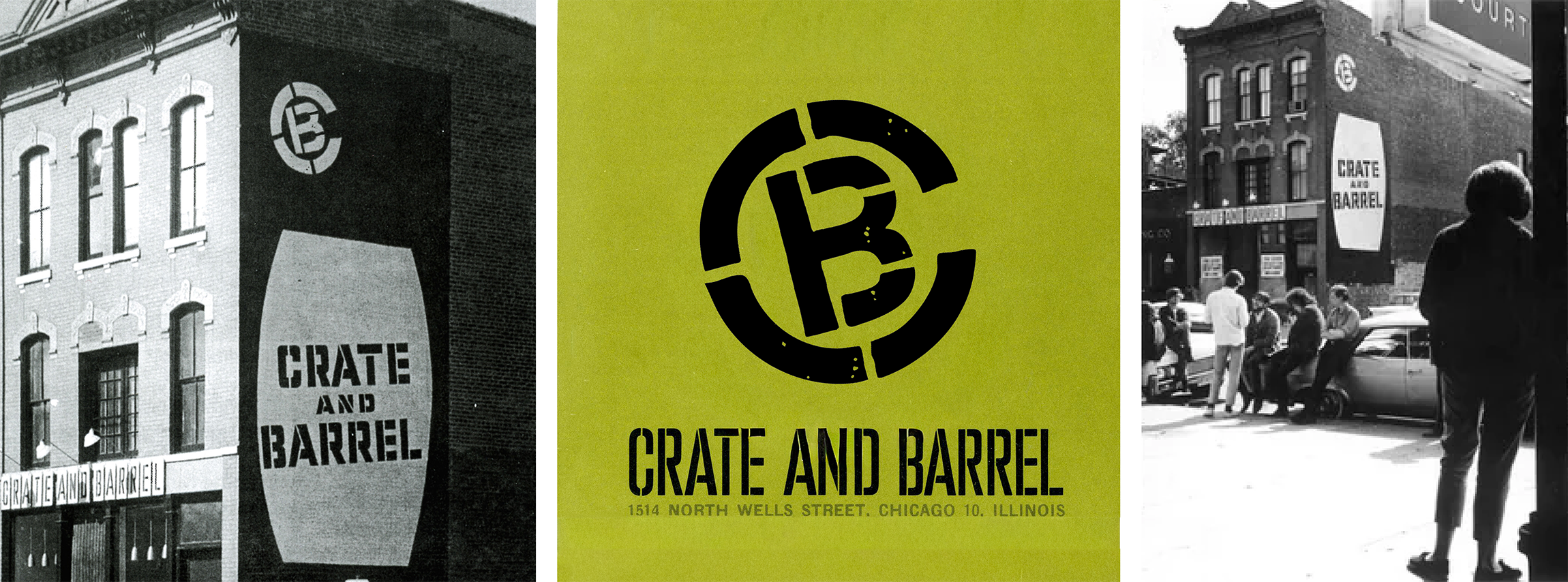
I was reminded of this recently when I was looking through my father’s design archives. In the sixties, one of his first client opportunities was to create the brand identity and marketing for a just-opened housewares store located in the artsy, funky, Old Town neighborhood of Chicago.
He was creating the visual expression of Crate & Barrel as the brand itself was still forming. Its young founders had a vision for selling simple, well-designed home goods that were modern yet humble, the brand's essence was just becoming clear.
As I pored over those original logo sheets, catalogs, and mailers my father had created, that feeling — modern yet humble, rang true. The stenciled logo, with a chipped up, distressed look so common now, would’ve been a little shocking back then. It was an authentic reflection of the store, which used repurposed crates, barrels, and cable spool tables as fixtures. The clean design, the simple type, and the frequent use of the barrel outline feels almost contemporary, (and not dissimilar to the recent modernization of the "other barrel brand," Cracker Barrel).

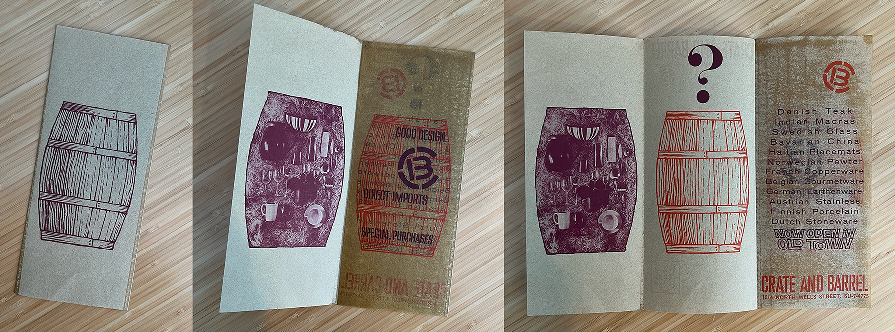
Crate & Barrel brand's embrace of innovation with a little wit was present from the start: a wedding fold to hold a catalog of goods; product pages printed on flysheets, with simple, clean images; a mailer with that barrel on the outside that, when opened, reveals a cutaway of the products inside.
Now, over sixty years later, with over a hundred Crate & Barrel stores, the brand has grown and evolved as the world and design sensibilities have changed. But the truth that was there, even before my father first put a Rapidograph pen to artboard, has carried through decades of trends, technologies, and transitions.
That’s the part I love most about solving brand challenges: there’s that simple human truth to every great brand. When you know why you exist and what you bring to people’s lives, the rest comes naturally. It doesn’t have to be complicated. Before the logo, before the messaging, campaigns, and content calendars, before optimizing AI and analytics, I always start with three questions based on my father’s thinking:
You can build a brand without having good answers, but it dilutes brand power and makes the road to sustained growth more difficult. Clarity at your core is a superpower. It’s always been true.
That’s not nostalgia. That’s strategy. And it’s as relevant today as it was that first time when Design Group 3 founder Stan Wilson helped his son make sense of a design challenge with the words, “If you know what something stands for, the rest will fall into place.”
Thanks, Dad.
If you’d like to explore how this applies to your organization, feel free to reach out. I’d welcome a conversation.

